Hello again. This weeks task focuses around using javascript and css to create dynamic web pages. We started with some source code for creating a basic loan calculator and the main aim was to add some more functionality and styling to make it more visually appealing. In this post I shall be discussing how I went about adding the necessary functionality as well as demonstrating some basic techniques for adding 'themes' or dynamic styles to HTML content.
Analysing the source code
The first thing I did was analyse the source code to understand how the calculator worked. Basically the user inputs the loan amount, the interest rate and repayment period. Using this information the monthly repayment, total cost of the loan as well as the total amount of interest paid is calculated. Behind the scenes, the javascript on the page uses the Document Object Model to access the values input, performs the required calculations and displays the results to the user by changing the innerHTML property of the corresponding <span> elements, fairly simple. I also noticed that whenever one of the input values is changed, the loan is re-calculated automatically. This works because the “onchange” event of each of these input fields was triggering the “calculate()” function.
Functional Enhancements
After understanding how the calculator worked, it was time to add some more functionality. The first thing I wanted to do was add a checkbox to the input fields such that whenever it was checked, a 10% discount on the interest rate was applied before calculating the loan. I then added the following condition to the calculate() function to calculate the discount whenever the checkbox was checked.

I also wanted to make sure that whenever the value of the checkbox changed the loan was automatically re-calculated. To achieve this I simply wired the checkbox's onclick event to the calculate() function.
Next, I wanted to display the total number of installments for the loan as well as the date of the last repayment. The number of installments was already being calculated so displaying it was a simple matter of creating a new <span> called "installments" and changing its innerHTML property during the calculation. Displaying the date of the last repayment took slightly more work. First I created a function that uses javascript's Date object to calculate the loan end date:
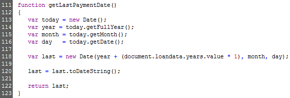
At line 118 of the above source code I am multiplying the value of the 'years' input field by 1 to make sure it is converted to an integer before being added to the year variable. Since javascript is an 'untyped' language there is a risk that the values are treated as strings and consequently the '+' operator would concatenate the values rather than adding them! Finally I used the toDateString() function to format the date.
Visual Enhancements
With the functionality ready, it was time to make the calculator more visually appealing. For this particular task, I wanted to go a step further than simply adding the necessary styling. I wanted to add the ability to change the calculator's style dynamically using javascript. To do this I used a combination techniques such as leveraging css selectors and css sprites. From the outset I decided I wanted only one CSS file, and that changing the style should not require re-loading the page. To do this I used css selectors such that every element on the page was styled based on the CSS class of the <body> tag. To further explain this, consider the following CSS snippet:

Lines 7 and 8 show the two schemes (scheme1 and scheme2) that can be applied to the <body> tag. Next, lines 12 and 13 show how the style of the H1 and H3 elements changes based on the scheme. Whenever scheme1 is active, H1 and H3 elements would be white in colour, but would be grey if scheme2 was applied. This concept was applied to the rest of the styles and allows me to change the entire look of the calculator by simply changing the value of the <body> tag's class attribute. The following code snippet shows how the scheme is changed according to the value of a drop-down list box:


CSS Sprites
Each scheme uses three images, one for the title bar and two for the button (normal and hover states). Instead of saving each image as a separate file I decided to combine the 6 images into two "master" images, one for the titles and the other for the buttons as shown below:


Line 29 specifies that the "form-title" has a background image and is exactly 40 pixels in height. Line 32 specifies that the background position of the image should be 0px both horizontally and vertically effectively showing the blue title bar only. When scheme2 is applied however, the background position shifts the image 40 pixels vertically (line 33) to display the yellow title bar. The fact that the title bar is defined as being exactly 40 pixels high makes sure that the rest of the image is masked from view. A similar approach was taken with the buttons, shifting the background position both horizontally (for state) and vertically (for scheme). The main advantage of CSS sprites is that they lower the amount of HTTP requests being made which makes the page load faster.
 Subscribe to email feed